





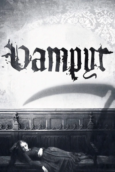
Unlike 1922’s Nosferatu, this “classic” is an absolute bore. Carl Theodor Dreyer‘s effects to create shadows in Vampyr are novel marvels, but aren’t worth even this 73 minute runtime. Dreyer’s lack of commitment to sound films results in a dry narrative with inexplicably pointless spoken dialogue and still a lack of it. Obnoxious intertitle cards needlessly break the “show don’t tell” rule, and Allan Gray’s endless wanderings aren’t atmospheric, they’re empty and monotonous. No sense of threat or dread. Much like vampires, this movie sucks! I’m the first person to ever make that joke, right?
Criterion really nailed that cover art though, huh?
Leave a Reply